Living Room: Hanging mismatched art

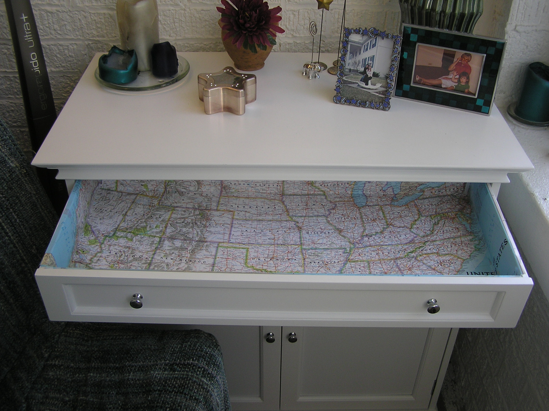
This “final” living room post has been rather difficult to write. I started with the idea that I’d talk about hanging the art around the room, but something about it keeps rubbing me the wrong way. Maybe it’s that there’s really no homemade or handmade element to what I’ve done (well, there is to two of the art pieces, but I’ll share those later), or maybe it’s that the whole discussion feels kind of privileged. Compared to the budget I had when I started this blog, this room was furnished in absolute luxury. Feels kind of like cheating. And it’s not say that the room is phenomenal either. It feels like home and I love a lot of individual elements in it, but I wouldn’t say it’s anything that shows I have an eye for design or anything. I think it’s pretty average for what a person can pull together with a little bit of money and a few decent pieces of furniture and art. So with that, I want to say, I am totally open to suggestions. Anything striking you as off? Any ideas for what would pull the room together a bit more? I’m fairly happy with the side by the windows, but the other half of the room doesn’t have the same “put together” feel.

Hanging art on the walls made a huge difference in making the living room feel cozier after I repainted it a light icy blue.

Some of the walls needed little to no art, mostly due to huge windows and big pieces of furniture.

TV corner after

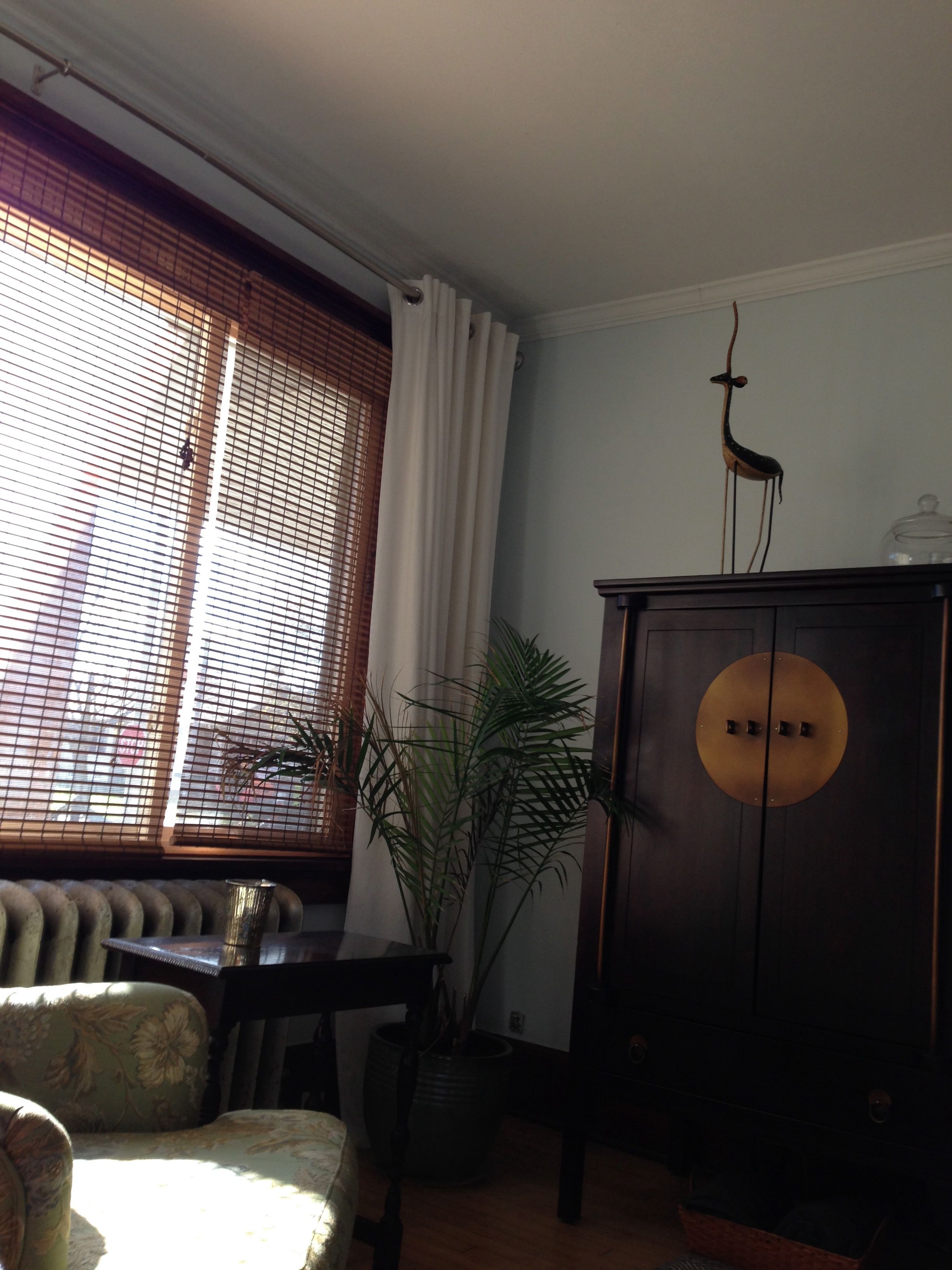
While all the others were in need of something.

I had a hard time deciding what to do on the opposite side of the french doors, especially since I normally leave that door open all the time. I could have left it blank, I suppose, but it’s very visible when you are sitting on the couch or the green chair and it just looked empty. In the end, I decided to go with one mid-sized picture and treat the wall as though the door wasn’t there. Here’s what it looks like from the couch at night. 

painting behind french door

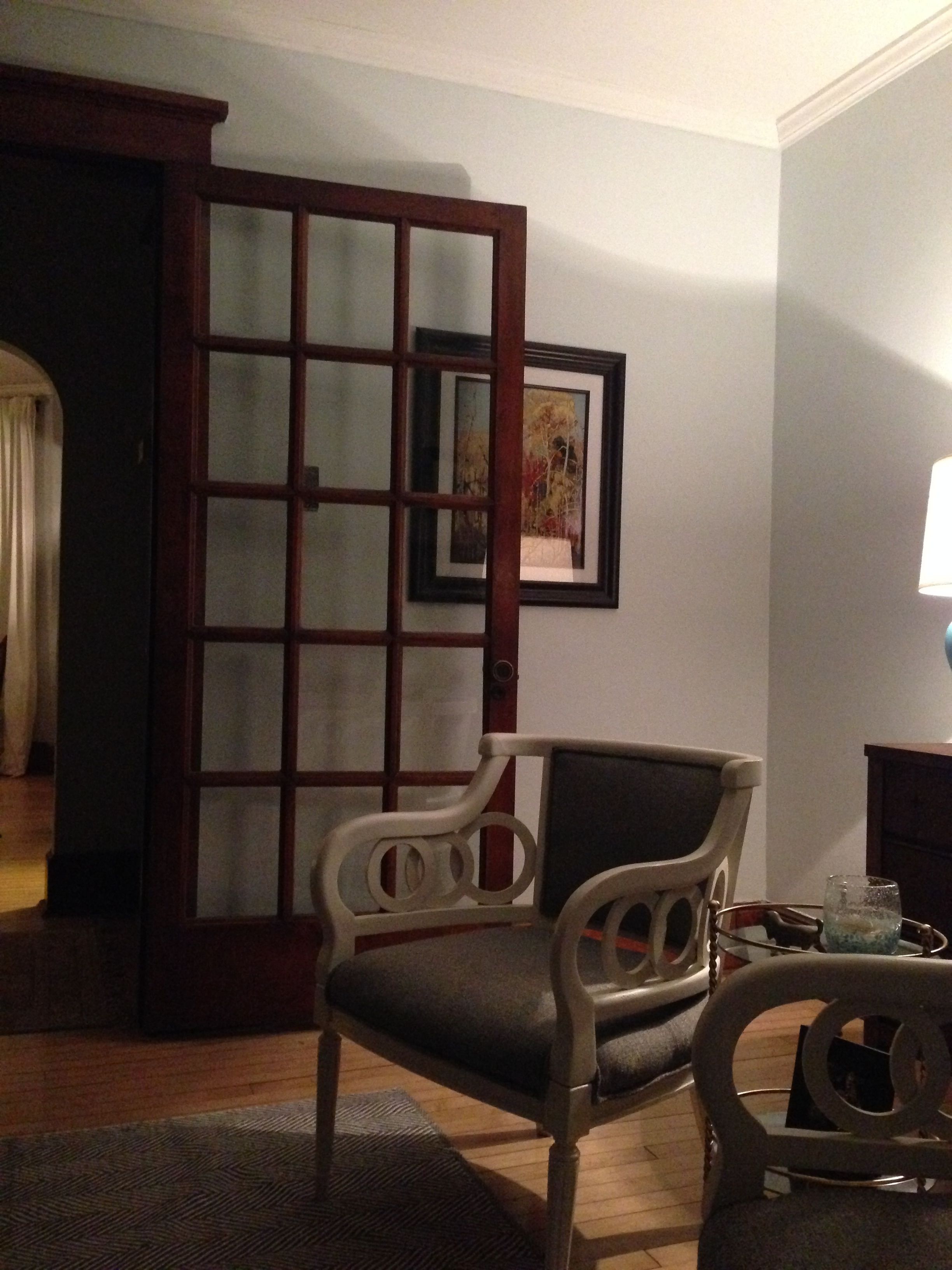
I actually could have gone a little bigger, but I had already decided to buy a big piece for the adjacent wall. It’s not ideal to have a picture partially obstructed, but it look better than it did with a blank wall—and it gave me an excuse to order a print that I’d been wanting for a while (Autumn in Orillia by Franklin Carmichael. I ordered the print from Art.com and LOVE the paper it was printed on. It was heavy and matte and textured – perfect for a water color print. I got the frame at Michaels after quite the hunt for a frame the correct size.)

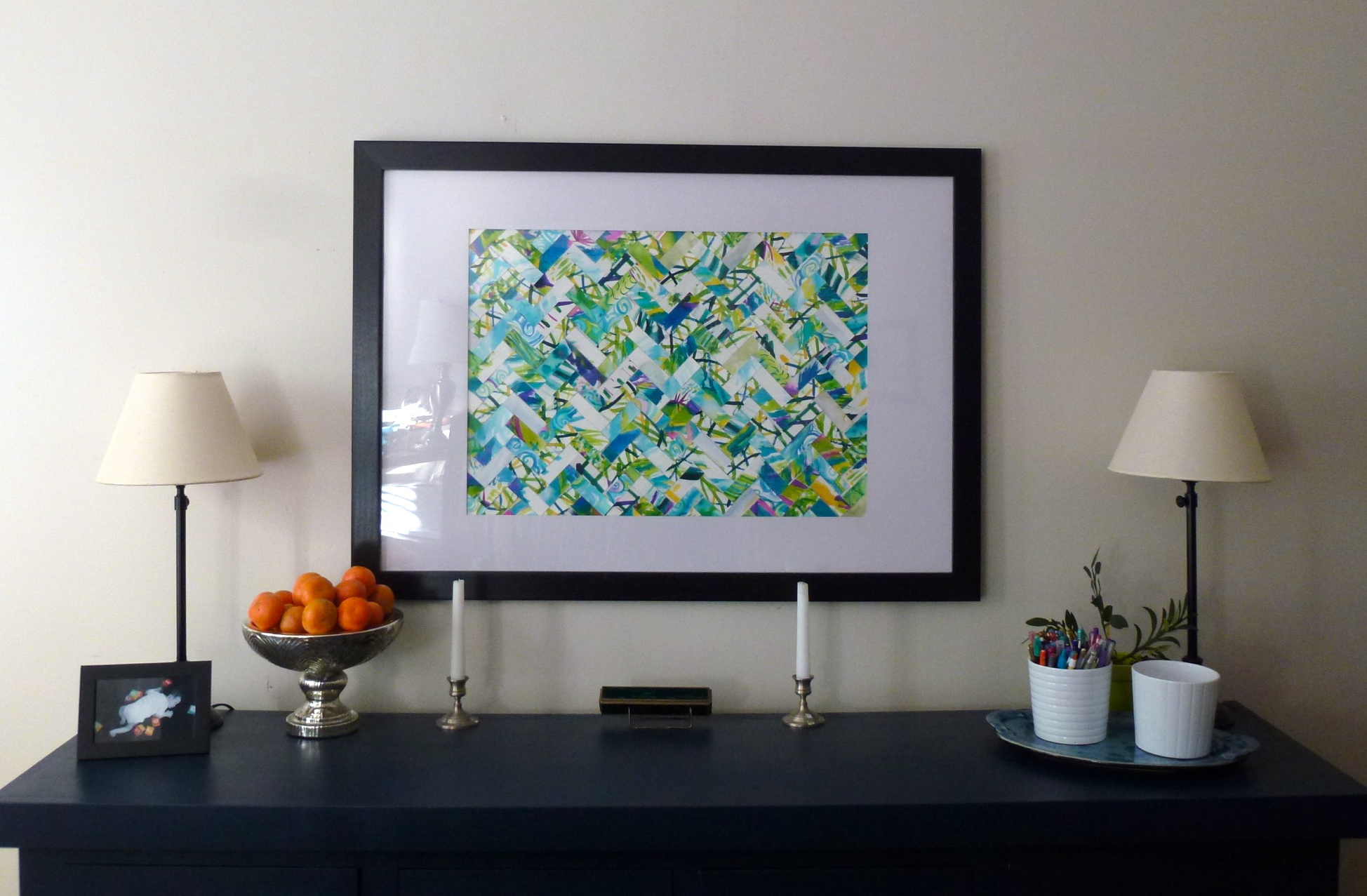
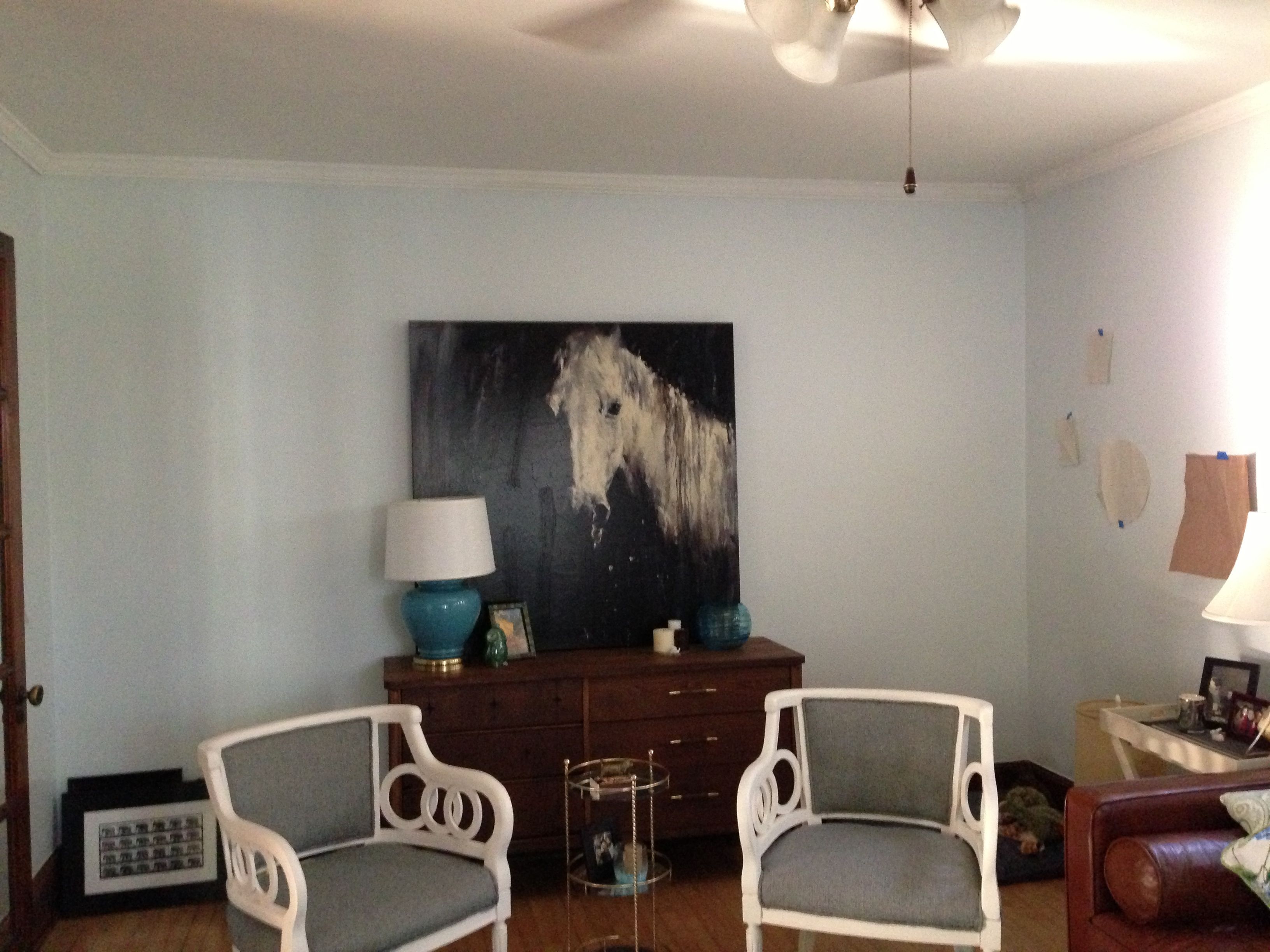
On the wall opposite the windows, I chose to go big and bold, yet simple with one gigantic painting that I’d been lusting after for two years. (To give you an idea of the scale, that painting is 48 inches by 48 inches and about two inches deep.)

IMG_0585

And on the wall next to that, you can see the start of my art collage project for the remaining wall. See, those first two walls were easy. I invested a some money in two pieces I really liked and had been wanting for a while. But if you’ve been reading for a while, you know I love collecting artwork that speaks to me, so it should be a surprise that I had quite a few framed pieces and bits of brick a brack sitting around waiting to be hung in the perfect spot.

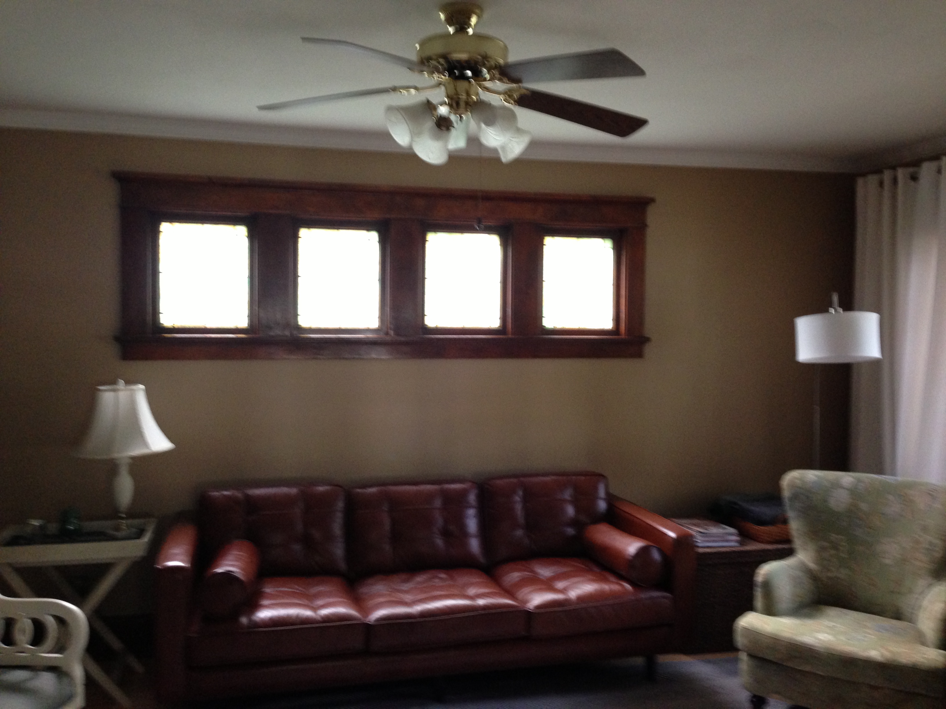
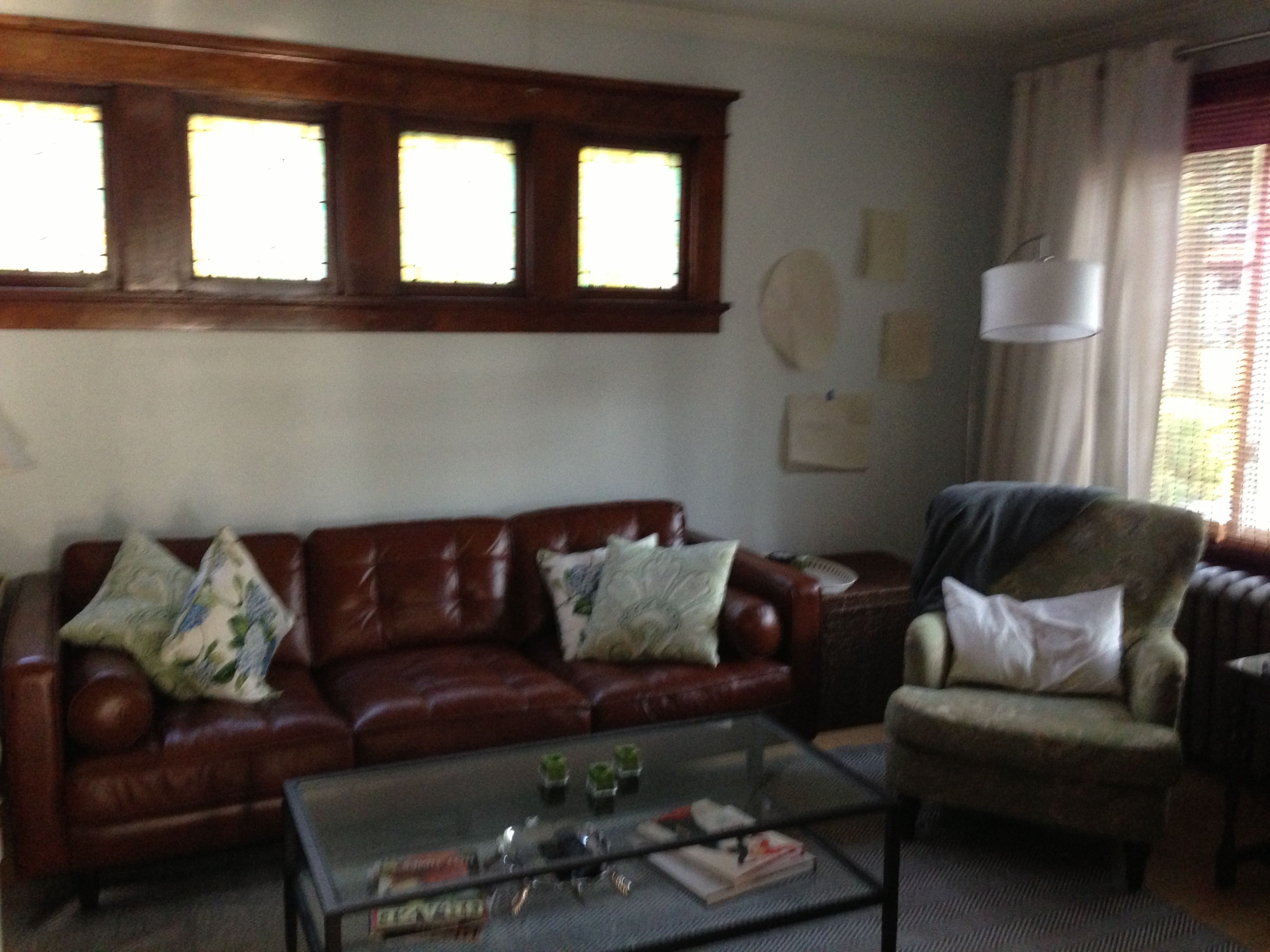
The big challenge of the living room was the wall opposite the french doors: A row of high windows, a low couch and two big blank patches of wall. (Ignore the paint color, of course. I neglected to take a proper “before” pic.)

IMG_0328

I had around a dozen pieces to play with, including framed photos, prints, some fun fabric pieces, a tortoise shell (faux, from Target) and a carved mirror. Almost none of the frames matched and the orientations went both ways. I followed the Young House Love paper-template approach to planning and traced the outlines of all the objects onto pieces of paper (I used a lot of packing paper I had laying around – a nice non-destracting neutral to play with, but it tended to be wrinkly). Then I used painters tape to play around with the different options.

big wall after

After a few days of hemming, hawing and rearranging, I finally got bold and started nailing. I started with the largest objects on each wall, and did a little rearranging after each additional object was added. And here’s where it ended up.

longlivingroomwall


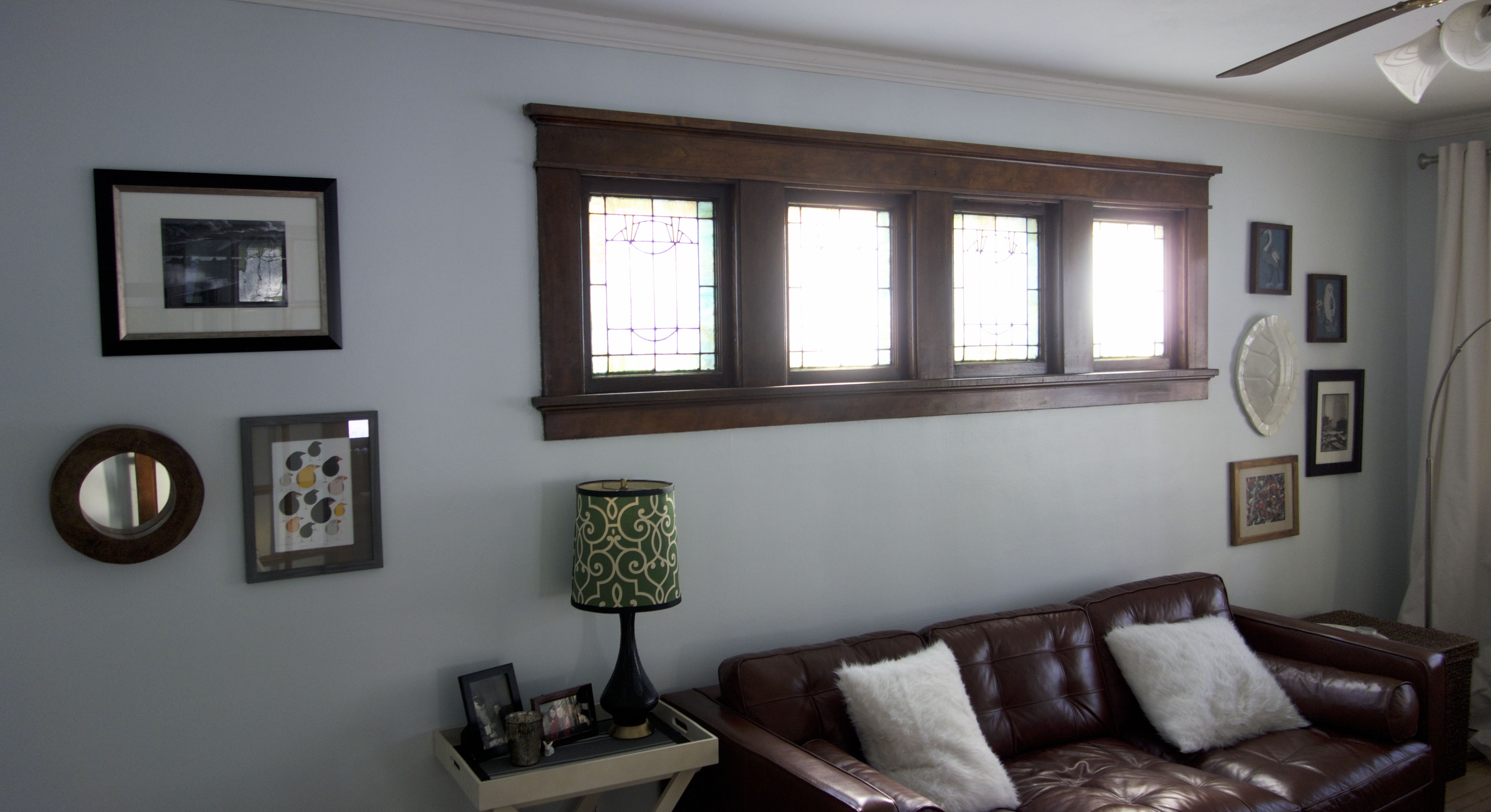
When it comes to hanging a gallery wall, I highly recommend the paper template approach. It made it so fast and easy and I knew exactly where to put all the nails. I really like how the arrangements came together on either side of the windows.

The things I’m still considering: Let’s see…should I expand the gallery wall and flow things under the windows? Should I put shelving or something in the two empty corners of the room? Get a longer sideboard instead of the dresser that’s under the horse painting? An actual table between the two refinished chairs? For now, I’m calling it done, but if I find a great piece that I think will help tie it all together a bit better, I may make some changes down the road.

Pinterest Challenge: Herringbone Art

banner

It’s Pinterest Challenge time*! This great opportunity to stop pinning and start doing is hosted by Sherry and Katie and is always a ton of fun.

Apparently DIY art is my favorite thing, and I needed something big to fill the wall in my dining room…here’s what I came up with:

DR Birthday Art

There’s a very popular pin of a painting all over Pinterest….I thought it was ok, but the colors aren’t really my first choice. Herringbone Art

The first DIY spin on this I saw  was Amanda’s using art by her kids:

I just had to do one of my own. I’ve been looking for something to replace my large/boring/generic/beige hand-me-down art from my dad in the dining room and this seemed like the perfect choice. Plus, she did it with her kids—so cute.

Then I remembered I don’t have kids. First I thought about getting some of my students to make me art, but I didn’t get around to it. Then I realized it could be my activity at my birthday party! (You know how when you’re a kid you have an activity at your party? And then you grow up and you mostly just drink? I missed that memo. I don’t drink, but I have to have an activity.)

  1. As soon as people finish their ice cream, tell them, “Now you have to make my birthday present!”
  2. Give them watercolors that your mom brought and some paper. Show them the picture above. Tell them you are going to cut it up and that you’d like them to use colors that match your curtains (only three people will actually listen, but its still worth a try).
  3. Have them paint.

4.   Let paintings dry. Ideally for a month. You want to make sure they are really, really dry. (You may also just be disorganized.)

5.   Figure out what size you want your pieces to be. Especially if people drew actual pictures, smaller is probably better.

3 sizes I considered. A 1:3 ratio looked best to me.

6.   Once you decide on your pieces (I did 1×3), measure out on the backs where to cut. Set aside any that you will not want uniform pieces of—basically anything that was a thing (like a tree) and not abstract.

7.   SPECIAL CUTTING TIP: I measured out one inch increments on one side and three inch on the other. If you have extra on one side, which you likely will, make your marks there and DON’T cut all the way through. You’ll end up with strips attached across the top. Then you can line it up and cut once to get several pieces, which saves a ton of time.

Measure the dimensions along two edges. If you use a paper cutter, you won’t need to extend the lines. Cut MOST (but not all) of the way across, so you have a fringe.

When you slice across the mostly-cut strips, you’ll get your pieces. Much faster than cutting strips into individual pieces.

8. Cut, cut, cut.

9.  Start playing. Lesley did this while I was still cutting and measuring.

10. Get ready to do this for real. My mat left a space that was 19.25”x27.25”, so I measured out a 20”x28” box on a large piece of white paper. I also sorted the pieces a little bit, mostly by color intensity.

Ruler, pencil, scissors, strips. And, um, toes.

In retrospect, I wish I had set aside a piece or two of everyone’s to make sure they all made it in. Pretty sure I was successful, but not positive.

11. Decision time: Do I want to orient the herringbone vertically or horizontally? (Horizontally. It’s a big wall)

12. What angle looks right? (I’m using math in real life! First I measured everything and now I need to find an angle!!!) [Spoiler: its 45 degrees. Lame. Although sensible.]

13. Play.  Lesley’s playing above helped a lot here. It was also interesting to see how the art changed when I was looking at a photo instead of the real thing.

14. Once I had a layout I liked, I needed to stick it down. It will be behind glass, so I was hoping I could just double sided tape. I used American Crafts tape runners, which I very highly DON’T recommend. Very annoying.

15. Leave it on your floor while you go on vacation.

16. Restick some pieces because you used cheap adhesive (thanks AC), stick it behind glass, and get it on a wall! Everyone loves it and I love that so many people who are important to me are represented in all the pictures.

DR Birthday Art

I’ve seen other cool takes where you use one large piece of art and cut it in that pattern and then restick it, or where you use a pre-existing painting and tape out the herringbones. Just look for herringbone art on pinterest for some other equally-awesome takes.

Check out the other projects linked up by the hosts Emily, Katie, Sherry and Renee:

pinterest-pic

And my other Pinterest Challenge Projects:

Circle Art: Framed

Ring Around the Artwork

Storybook Final

Childhood Favorites Art

Finished Drawer

Map-Lined Drawer

What did you do? Do you share my desire for making tons of homemade art (there is tons more that weren’t Pinterest Challenges…I don’t know what’s wrong with me!)

New Apartment: Bathroom

Practically speaking, the first room I needed ready to go was the bathroom. There were some considerations I needed to work around. Here’s the before:

IMG_0078

Here’s the current:

IMG_0148

I had to take down the cabinet over the sink because it was a little too scuffed, and since it was made of particle board, I couldn’t paint it. I replaced it with an Ikea mirror that uses a hinged mount – the perfect solution since the tiled part of the wall sticks out. It was also an oddly sized space for a mirror and this square one fit. (It looks a little high in the picture, but it’s really that the light fixture is oddly low. We hung the mirror at a height so normal-height people could use it.) I added two floating shelves with baskets above the toilet for a little extra storage within arms reach when I’m at the sink.

IMG_0150

Since I’m working with these odd cabinets in the shower (which are nice because of all the storage), I had to mount the shower curtain rod at ceiling height. I had to order an extra long shower curtain, so my options were limited, but I like the ruffled white curtain (with white fabric liner) – it adds some texture and feminity to my really linear bathroom.

We also painted the bathroom. Funny story – I had a ton of samples from the paint store and kept holding them up on the wall, and this one was the instant hit with me and my mom – and then I realized it was the exact same color I had painted my bedroom upstairs. So I just used my leftover paint from that room.

IMG_0149

And lastly, my pictures. I took the messed up framed butterflies from my hallway and cut them down to square size with a utility knife. Then I fit them in these extra-deep square frames from Ikea.

Boyfriend Birthday Art

Boyfriend’s not a crafty guy. He’s not much of a reader either, and definitely not a Young House Love junkie like some people here.

But after teasing me about Lesley coming down and the two of us waiting outside in the rain to get our very own autographed copy of their book, he had to see what the fuss was all about.

YHLBookAnd he saw a picture of this:

(Not the picture from the book, which isn't even about the art in the first place)

And he really liked it. Enough to refer back to it a couple times, and for me to decide it would be a pretty good birthday present. So for his birthday, I grabbed a big canvas, some craft paint and a few brushes (ok, I already had the brushes). I wrapped them up with a little canvas (to represent the big blank one which I didn’t think was worth wrapping). After a little confusion, he was excited, and over Christmas break we got it done.

Turns out he’s also totally hired on as my new staff photographer (have you noticed how bad all my pictures are?), so that’s a plus.

So we got out our canvas, a yardstick, several shades of green craft paint + white + silver metallic for some depth, a couple brushes and a paper plate for mixing.

So we got out our canvas, a yardstick, several shades of green craft paint + white + silver metallic for some depth, a couple brushes and a paper plate for mixing.

Then I got to measuring. We did 1.5 inch marks, using the yardstick facing the same direction down both long sides and then lining it up between the two marks to make lines. Then I just grabbed an envelope and made some random arrows. This part was hilarious. It’s not for me, so I was asking Boyfriend what he wanted. So he went and got the book, and started scrutinizing the picture. “Well, she never does too many close together.” “Don’t do diamonds. She didn’t do diamonds.” The best was “Ok, she did two, then three, then two, then four…” as he actually started counting how many arrows in each line. I stopped him and pointed out it didn’t have to look EXACTLY like what Sherry did. That’s an IT guy for you, right?

Arrow art measure 1Arrow art measure 2Arrow art make arrows

Then it was time for painting. As with anything paint, you can always go darker, so I started with what I thought would be a mid-to-darker color (which was one of my greens mixed with white). Of course, it ended up being our darkest.

Arrow art progress 1From there, we just mixed new shades, usually just lightening what we were working with, and adding a lime-y green to some mixes, with silver to others (I didn’t want it to look too flat and Sherry didn’t provide formulas, so I was allowed to do this.)

Arrow Art progress 2My new photographer Boyfriend even made me hold it up at regular intervals to make sure he got some good progress shots (see, totally hired!)

Arrow Art Progress 3And I started on the little bonus canvas you see–see if you can find it later in my house!

Arrow Art Progress 4And then finally it was done! He loves it and so do I. Right now it’s hung sideways on a nail in my house waiting for his move to a new place at the end of the month. But it will be the first thing you see when you walk in his new place. Now if I can just convince him I don’t do this with everyone I date (which is true! Right Lesley?!)

Arrow Art Final 2

What’s your favorite piece of art you’ve made?

Paper Stars

Paper stars were one of the first, if not the first, craft project Mary and I ever did together. We originally made a bunch as a birthday present for a friend who was decorating her room with a starry night theme. (Apparently when someone tells me I probably can’t do something, like make 3D stars out of paper, I feel inclined to prove them wrong.) They were a huge hit. Then we made a bunch for our room. Then, when we moved, we hung them from the ceiling of our office.

So when we were trying to think of something good for our blog masthead, paper stars seemed like a logical choice. And now you can learn to make your very own!

Now, making the template takes longer than making any of the stars. And the first one or two might be rough, as you are learning to make even folds and match up edges and get the glue to hold while not flattening the whole thing. But! Once you make the first few, they are actually pretty fast and addictive.

Paper Stars

You’ll need…

  • Stiff paper for template
  • Decorative paper for the stars (we’ve used construction, water color, and scrapbook paper with equal success)
  • Protractor
  • Pencil
  • Glue (fine tip glue for scrapbooks works really well)
  • Scissors

Template

  1. Trace a circle onto the template paper using the inner edge of your compass.
  2. Place the Protractor over the circle, and mark at 90° and the mid-point of the straight edge. Flip the protractor so that you mark it at 90° on the other side—marking a straight line dividing the circle exactly in half. Use the edge of the protractor to trace this entire line, and mark the halfway point so you can see the exact center of the circle. (My protractor has a handy opening for just this purpose.)
  3. Making sure your protractor stays centered, mark a point on the circle 72° from the marked line.

    Draw a line through that point and the center point to the other side of the circle.

    Repeat until you’ve made five lines, and the circle is divided into 10 sections. (Alternatively, you can mark every 36° around the circle and connect the dots to make the 10 sections.)
  4. Start at the top point, skip three lines around the edge, and line up your straight edge between the top point and the fourth point. Draw a line between the points.
  5. Skip the next three lines and use your straight edge to draw a line between the fourth point and where you left off.
  6. Repeat until you have a five-point star.
  7. Move your straight edge about 3 or 4 mm from one of the star’s sides and draw a parallel line, skipping the inside of the star itself.

    Repeat until you’ve created a second set of lines around each point (these lines are used for the flaps).
  8. Use your straight edge to mark a gradual taper at each point between the outside lines and the point.
  9. Cut out your template, following the outside lines and the tapered points.

Cutting and folding stars

  1. Trace the template onto the back of your decorative paper. Repeat to trace a second star.
  2. Cut out both stars.
  3. Fold the star in half from an outer point to the inner point directly across from it. Unfold.
  4. Turn the star, and fold in half at the next point.
  5. Repeat until the star has been folded in half at every point.
  6. Gently fold the star, tucking the inside point down and folding the two “legs” on either side together.
  7. Repeat around, so that every inside point folds in, and every outside point folds out.
  8. Now you’ll need to cut a small notch on every inside point to make the folding flaps. Look at your template to see how large this flap needs to be—it’s the distance from the outside of the template to the inner point on the inside set of lines. Cut the notches on all inside points.
  9. Fold each flap in from the notch to the tip of the outside point.
  10. Repeat with the other star, and figure out which points best match each other when they are help inside-to-inside.
  11. Place glue on the flaps of two adjacent points, and firmly press the two star halves together along the glue line. It doesn’t matter if you flatten the stars at this point.
  12. When the glue is dry, gently pop the stars back into their 3D shape, and add glue along two more edges. Be more gentle as you press these edges together—the more edges that are glued, the more difficult it is to pop the star back into shape.
  13. Glue the final edges together and gently press together–by this time, the shape of the star itself should help hold it together.

As you create more stars, you’ll get better at folding evenly, and you’ll discover your own technique for gluing.

{Mary adds:}

{I made a mobile for a coworker with a new baby using the star template, and it turned out awesome. Non-directions here–at the end.}

Have you ever made something cool just to prove you could?

Framing artwork

So Mary and I had our typical reunion weekend: We got our DIY on.

We spent some time talking about her bathroom and even went tile shopping.

And we spent a long, long time learning that navy blue looks very Americana on large pieces of furniture, rather than blue-black.

And we had some fun at the World’s Largest Block Party:

The lesson from this photo is: Don’t take a photo with your back to the sun.

And I had some great success frame shopping!

Over the last few months I’ve purchased two reprints of historical photos (from 20×200.com) A colorized photo of Paris during the 1890 World’s Fair and an early motion-photography series of an elephant walking. They both presented some framing challenges in that neither fit standard frame/matte size.

Let’s start with the Paris print. I found a frame that I loved at West Elm this weekend. I thought the neutral tones would look great with the old-timey sepia tones of the photo. But when I placed it under the matte, I saw this:

Big strips of white on the top and bottom.

At first I was really bummed. I love this frame and picture together, but I couldn’t see how it could work without a new matte. Then I realized I could just take a craft knife to a sheet of nice paper and make a little window. So I searched through my paper collection and found a sheet of creamy watercolor paper. I used a light pencil to trace the inner edge of the matte onto the paper, then I measure just far enough in on each side to cover the white (I had to come in on the non-white sides too, so it would look even). Then I used the craft knife and a straight edge to cut out the inner rectangle. I’ll admit—it took me a few tries to get the corners perfect and all the lines straight, but look at the final result:

I had a similar issue with the elephant print—we found the perfect frame last time Mary visited me. It was just the right proportion to fit the image, but we couldn’t find a matte to match. So I had a custom matte cut at Michaels. We did have a little mishap with the first matte—it was even around the paper, not the image—but Michaels redid it for free, which was great! Here it is with the standard frame and custom matte:

Perfect fit!

Now my only dilemma is where to put them. Right now I just have them propped against the walls in different rooms, which works fine for the time being.