Living Room: A Paint Saga in Three Acts

When I first moved into my new apartment, I showed you all this picture of my living room:

IMG_0097

A dark room with sage green walls with a nice dented texture that you can see on the left. Since I was sticking with light gray for most of the rest of the apartment (Burnished metal in the foyer, dining room and back hall and French Silver in the bedroom), and this was one of the few rooms that was open, but separated from the other rooms by wood trim (the halls, kitchen and dining room all flow together with plaster archways), I thought it was an opportunity to add another color to the house. I know some people like to use one continuous color when rooms are open to each other, but I really like the effect of looking from one room to another and seeing a touch of something different – as long as it works together! (My disastrous interim kitchen color did not, which is a story for another blog entry.) With all the wood accents throughout the apartment, I thought brown would work really well and would make the room feel warm and snug. I’d planned to get a light gray couch, a gray patterned rug, a light-colored ottoman coffee table, and then I was finally going to recover those estate sale chairs in a light/neutral fabric and paint them white.

But, where I ended up was this:

Brown Living room

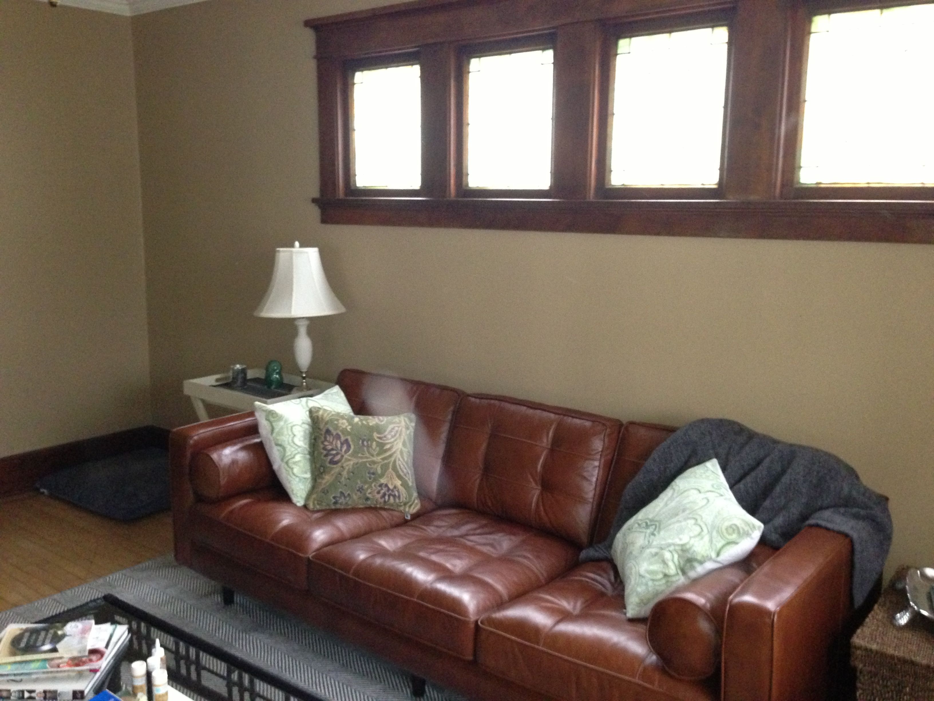
As I mentioned before, I ended up getting a brown leather couch. I’d spent hours and hours looking at couches online and reading reviews. I didn’t really want an IKEA couch (the reviews for long-term wearability are mixed, plus I’d have to rent a truck and spent over 3 hours driving to get one), but I was considering a Karlstad with the gray cover, because I thought it was the only new couch I could afford. I also considered a fake-leather/bonded leather couch in light gray from an online site, but I was really leery of buying something that big sight unseen and cushion un-sat-upon. Leather would have been my first choice because of the dog—when we were upstairs her hair was constantly getting woven into the upholstery of the gold love seat. I was spending a ridiculous amount of time vacuuming, lint-brushing and tweezing the hair out of the furniture, even with protective throws in constant rotation. (I did try banning her from the furniture, but that made both of us unhappy.)

I really wanted to invest in the couch as my first piece of real, honest-to-goodness-grown-up furniture I picked out myself. I was 33. It was time. I went to JCPenny to look check out the gray fabric version of their Darrin couch and it turned out they were clearing out ALL the furniture. The floor models were going for insanely cheap (50% off list price, and this was when JCPenny was doing the no-sales, low price all the time thing). And suddenly, I had the opportunity to get a gorgeous, real-leather, mid-century style, ridiculously comfortable couch. A leather couch had previously been way, way, way outside my budget, but combined with the credit card deal they were running, I ended up paying $750 for a very high quality piece of furniture. I know that still seems like a lot of money to some people (it did to me – the couch is officially the most expensive thing I own aside from my car), but I think I’ll have this couch for a long long time. And I love it. More than one person can sit comfortably on it! I can stretch out and nap on it! People sit on it and comment how comfy it is. And the dog hair comes right off with a brush of the hand or a light vacuum. So, so happy with the couch. But it meant the brown paint on the walls and the wood trim was causing brown overload.

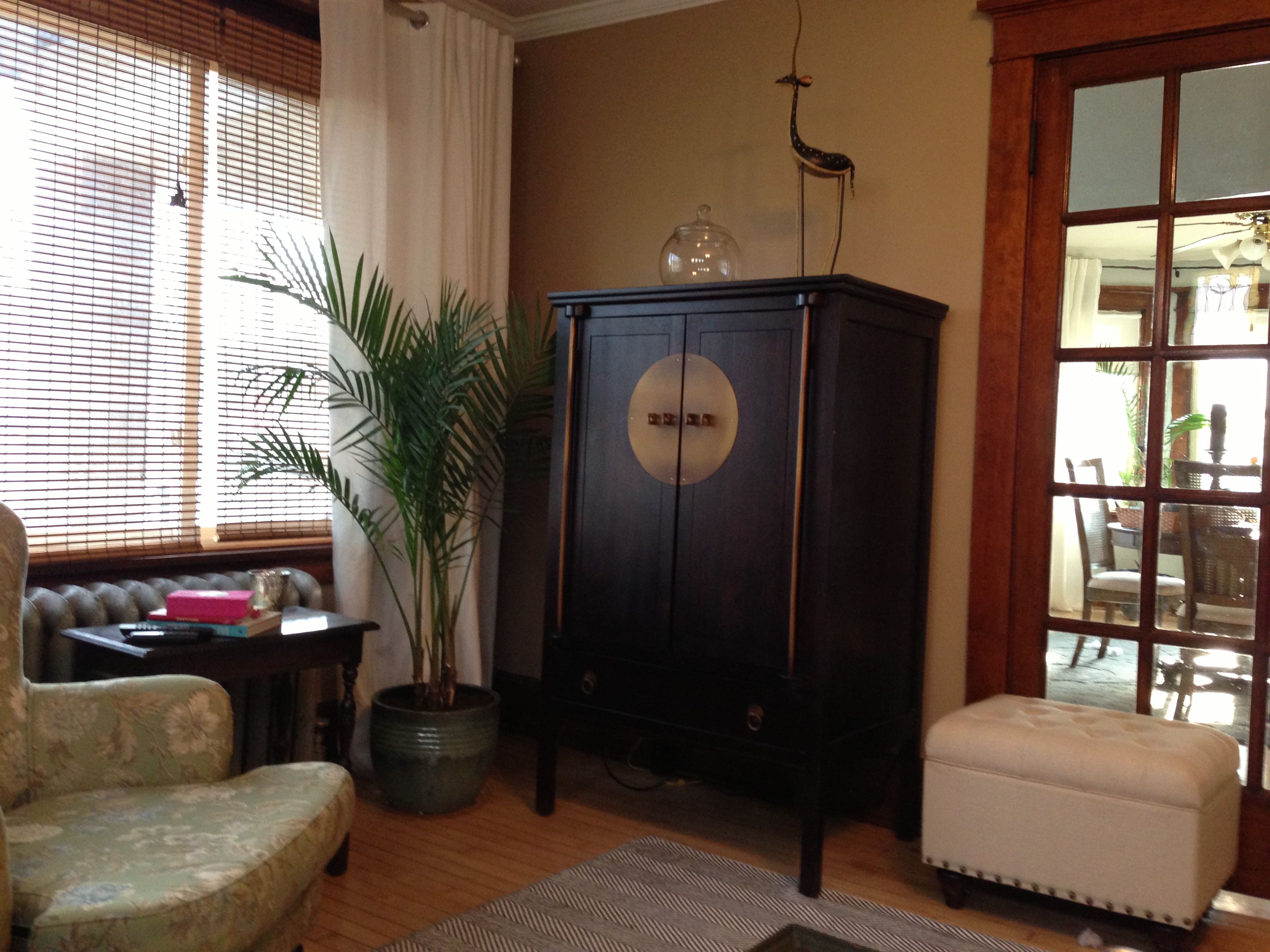
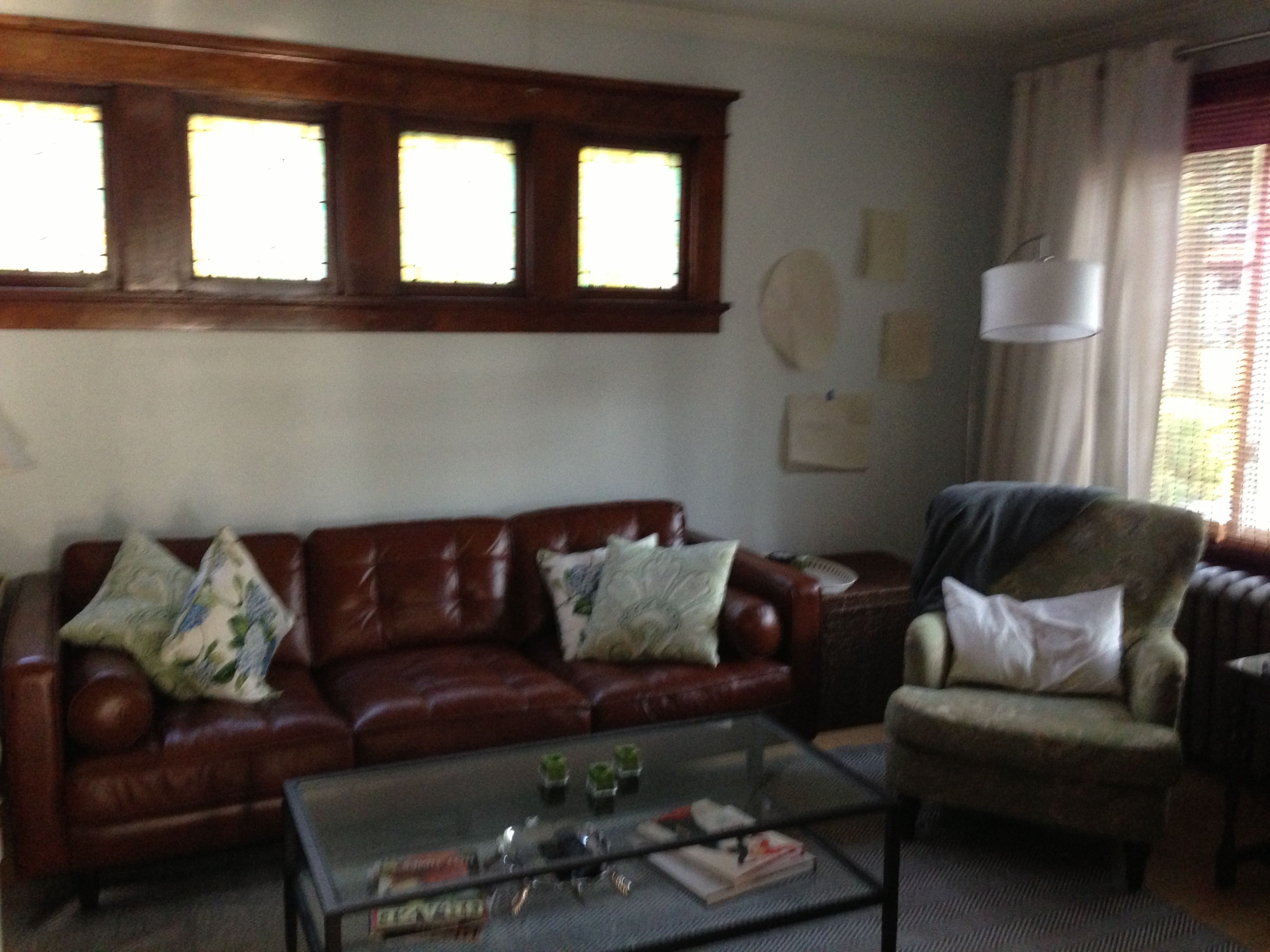
And it only got worse with each additional piece of furniture, like this:

brown living 1

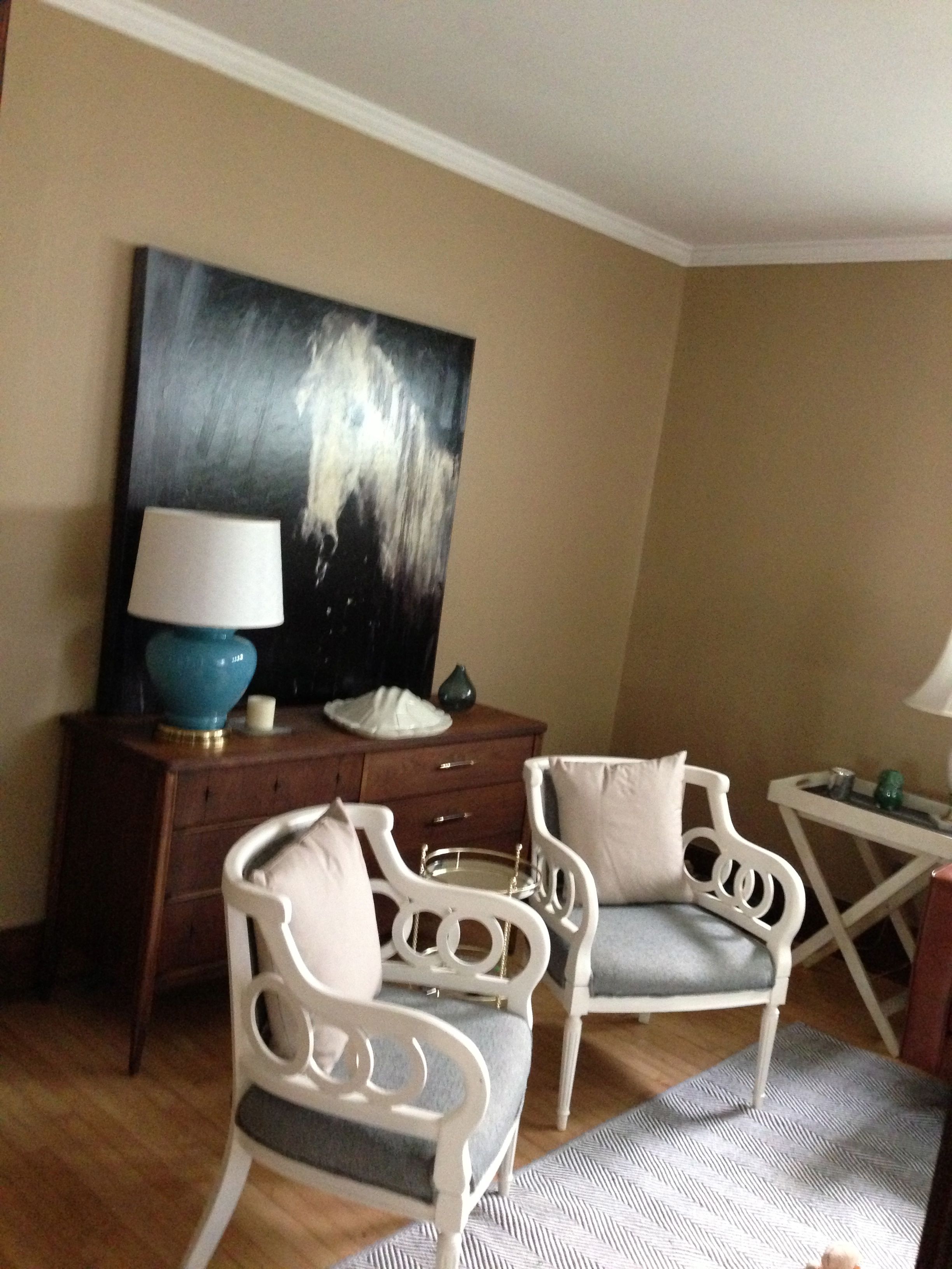
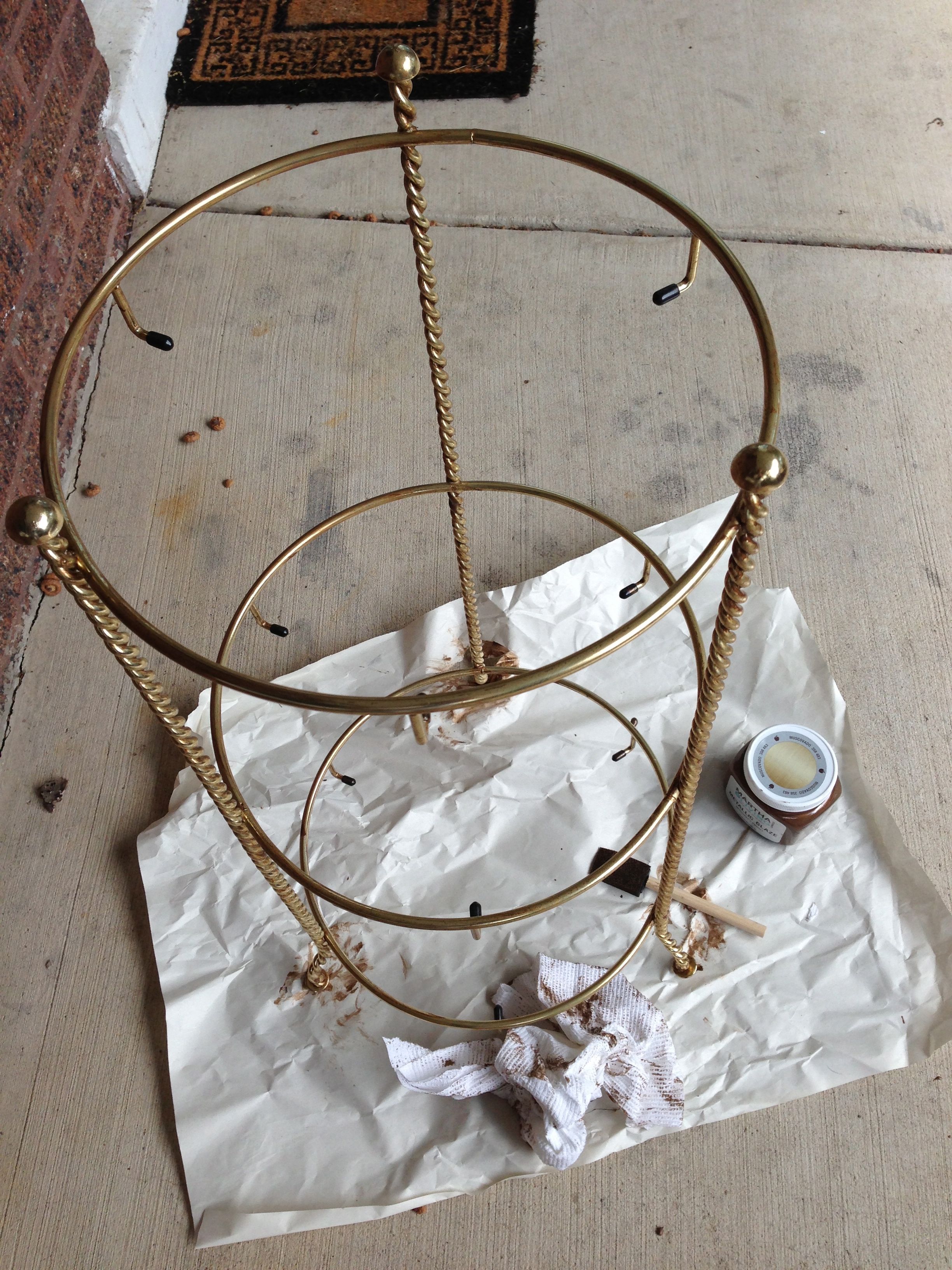
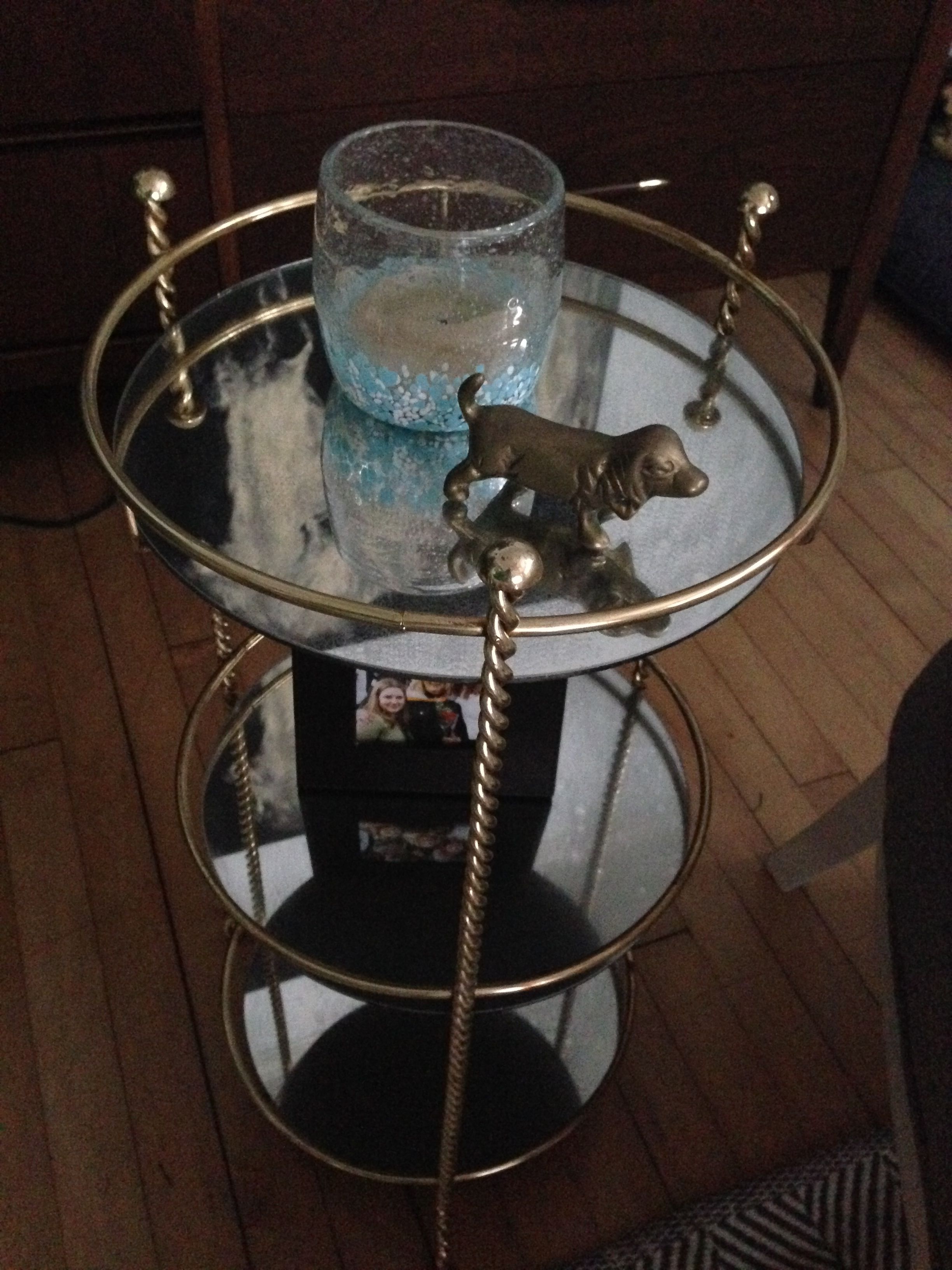
Let’s add a big wood dresser to the back wall, shall we? Because there’s not enough brown in here yet. In this picture you can see how I desperately attempted to lighten up the room with the light-colored chairs (and we will talk about the chairs soon—didn’t they turn out great? My mom basically did them for me) and the light pillows and light rug. And then added a giant horse painting, which just made it even less cohesive.

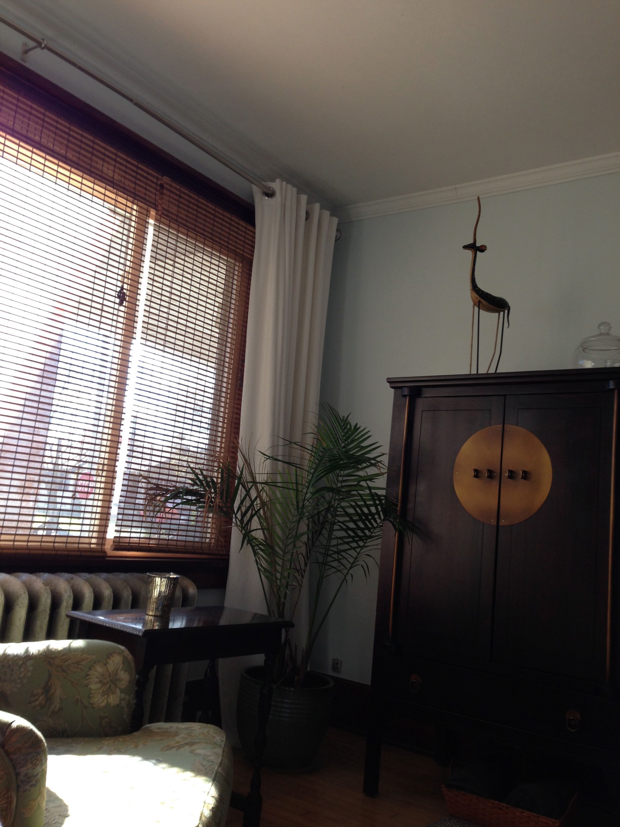
Basically, the only part of the room that was even remotely working was the window wall, and that was mostly due to the long white curtains I added:

Living before

There were light-colored curtains, and the light rug, and the cream ottoman and light-green chair. I even had a plant. The whole brown-on-brown-on-brown thing wasn’t bugging me as much on this side of the room. But it’s pretty sad when you only like one corner of your living room. So…

paint supplies

It was time to haul the painting supplies back out (keep in mind that I spent the first month living here painting every single wall and much of the trim. It was ridiculous.). I decided to go completely in the other direction and do a light, airy almost-white blue. I settled on Fresh Day by Behr (which almost looked like a neutral instead of a blue). It took about three coats of Behr’s paint and primer in one to get a clean covering of the brown — the plaster walls in this place just suck the paint up.

And the end result:

TV corner after

Same corner as before, but doesn’t it look so much lighter and happier? Now, the other corners of the room actually wound up looking a little sterile with the lighter color:

IMG_0585 big wall after

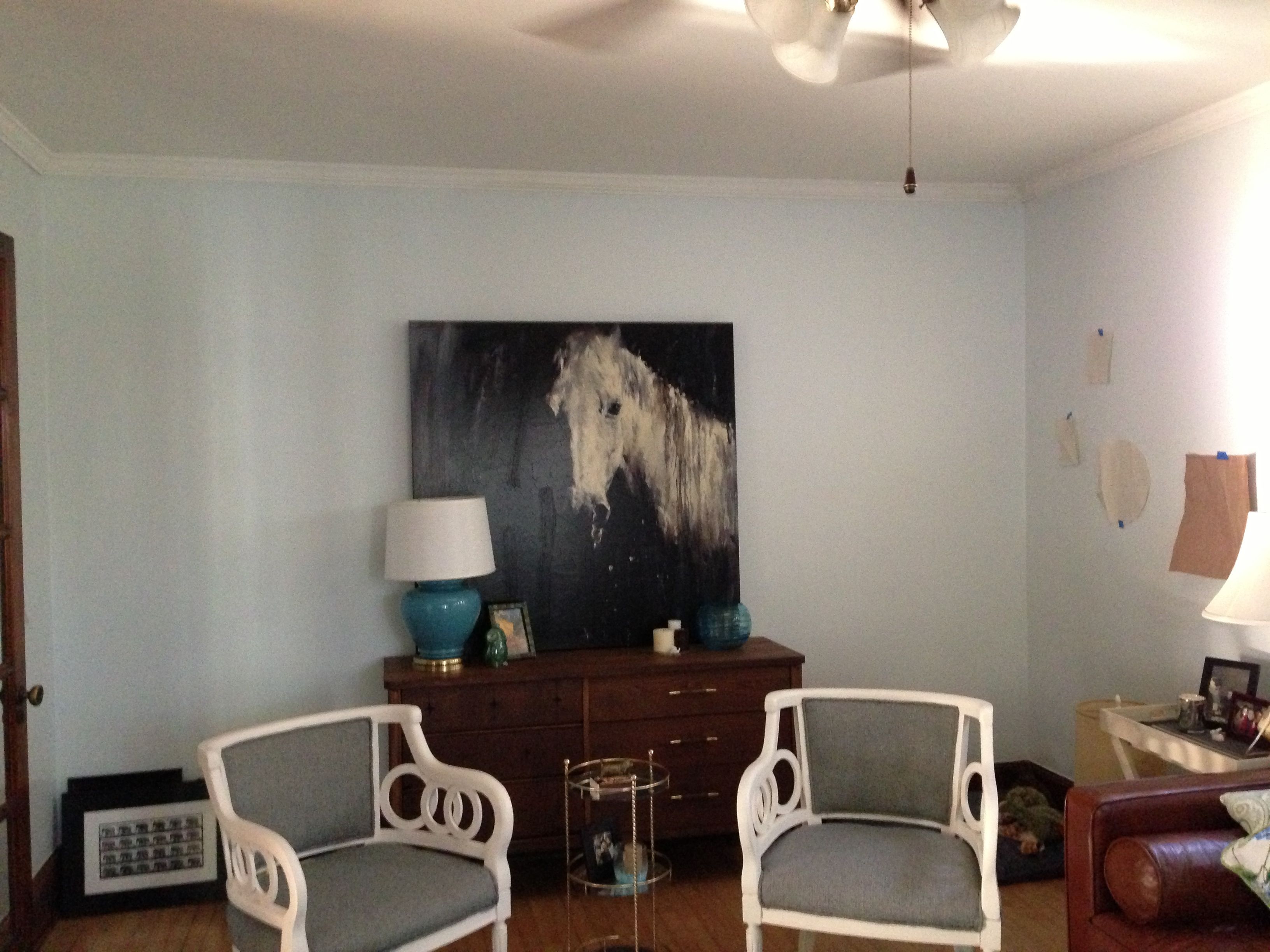
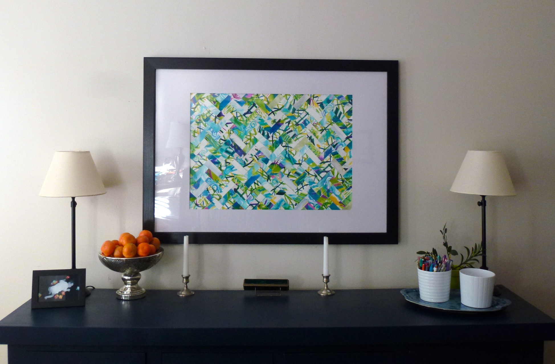
So I was a bit desperate to get some art on the walls to warm it up. We’ll talk about art next time, because I have had so much fun finding new pieces for the new place and figuring out how to get them all hung!

(In this picture you can also see that I replaced the too-short coffee table I originally purchased off Craigslist with a larger, taller table from Potter Barn. After trying to live with it for a few weeks—because it was really cute—I realized that in order to be comfortable I needed the table to be at least an inch taller than the couch seat cushions. I tend to have a cup on the coffee table and constantly reaching way, way down for my beverages was driving me crazy.)

But that’s it: The color evolution of the living room. Have you ever made a big color mistake? How long did it take you to give in and repaint? It took me about two months for the living room, but I redid the kitchen about halfway through the first coat of the first color.

Advertisement

Making something old look…older

When I moved into my new place, I was seriously lacking in furniture. It wasn’t like I didn’t have any furniture—I had a few very nice pieces actually—but the square footage I was trying to furnish had expanded and the space was oriented very differently. I had a dining room, and an extra bedroom, and just a whole bunch more space. So with all the extra space, I was grateful for any extra furniture that came my way, even if it was something I never would have picked out myself.

Enter this little three-tier stand/table:

tiered stand before

(Apologies for the awful picture. This is project is pre-new-camera.)

Another random Mom gift. She picked it up at a rummage sale. It kind of screamed 1980s plant stand. Or maybe something you’d put in a bathroom. In any case, it was bright and brassy in the most cheap-yellow way.  But, as with the lamp, Mom saw the potential hidden by the ugly and suggested I paint it or something.

Now, I’ve been eyeing brass for awhile. I usually associate it with really horrible cheap light fixtures. (I’ve been an apartment dweller for over a decade now. I know cheap brass light fixtures.) But it seems to be making a comeback, especially when it comes to true vintage brass. Look at this beautiful antique bar cart:

3075

I mean, I know they are worlds apart, but the dark brass is gorgeous and it has three levels. So I decided to go for the antique look with my little ugly stand, mostly because I was desperate for a little table for the living room.

The first step was to dress up the garish bathroom-appropriate mirrored shelves. I used Krylon Looking Glass spray and a water vinegar mixture to get an antique mirror finish.

tiered stand during

Luckily, this project took place when it was still warm because this stuff is smelly. I worked out on the front porch. First I cleaned each shelf, then I lightly sprayed with the vinegar/water mixture, and followed that with a light spray of the Looking Glass. I let it sit a few minutes, then I blotted gently with a paper towel. Then I sprayed even more lightly with the vinegar mixture and more heavily with the Looking Glass. It took a few more repetitions before I felt the glass looked suitably antiqued. I recommend using the layered approach—you can always add more patina, but it’s hard to get it off. I blotted one last time, let it air dry for a few hours, then very gently buffed it with a paper towel before I reassembled the stand.

tiered stand glazing

While that was drying, I tackled the job of making the bright brass look a little more antiqued. I used a Martha Stewart metallic glaze in bronze, a sponge paint brush and a paper towel. I was pretty generous with my glaze applications (just light enough to keep it from dripping). I’d let it dry a few minutes, then wipe off the excess with the paper towel. Then, after it dried a few more minutes, I did another coat. The glaze is very transparent, and it took me between three and four coats to get the effect I wanted. Those twisted wire legs were quite a pain! But, you can see in this picture that after a few coats the brass was starting to look more like dark antiqued brass.

I let that dry for a few hours as well, then brought it in and reassembled it:

tiered stand finished

Voila! It’s not the antique bar cart of my dreams, but it’s a cute little table that’s perfect for holding a candle, picture, or drink. I love how the antiqued mirrors turned out. They’re mottled, but still pretty reflective (as you can see by the upside down horse head).

Covered lampshade

A few weeks ago, I came home to find a surprise lamp in my living room. A really (hate to say it) ugly surprise lamp.

For years, my mother has said that she disliked the carved milkglass lamp I’ve had in the living room. I like it—it’s classic.  But mom didn’t like it, so she dropped off a surprise lamp. It was beige, with a dirty cylindrical shade. There were chips in the side and it was oddly spongey looking. And I transformed it into a really cute lamp using just a little craft paint, some fabric, and ribbon.

IMG_0603

I used Martha Stewart craft paint in basic black to to paint the base. It took about four light coats with a foam brush to get full coverage. Then, I used a bold indoor/outdoor fabric to cover the shade following these instructions from the blog House of Fifty. It wasn’t too hard, but I really don’t recommend indoor/outdoor fabric for this project—It doesn’t stick well to the glue or the tape, making the project more difficult than it should be.

IMG_0616

I’m really happy with the results. It’s dramatic, and looks a lot more upscale than it really is. Not bad for a free rummage sale lamp and $15 in paint and fabric.

Dinners, Crafts and Games

When I was looking for my condo, I really wanted a dining room. My specific request was “a real place to put my table” but what I was hoping for was an actual dining room, not just a good sized corner for the table or an eat-in kitchen.

DIning Room Full

This was exactly what I wanted. When I first moved in, the dining room had a table & four chairs, an armchair in the corner and two bookcases. It was a little…sparse. It was also really beige. The walls are a perfectly acceptable neutral, but pair that with several wood bookcases, a wood table & chairs, bare wood floors…you get the picture. I wanted curtains to really soften it up, but I didn’t want just one color. I searched for ages for the right patterned fabric, and my mom sewed the curtains for me.

DR windows

The background is neutral, so it goes well with the walls (and new chairs), but brings in lots of color and movement. They have several shades of blue and green, with a little teal and yellow mixed in. Plenty of colors to play off of, like the green tablecloth I picked up on clearance at Target.

I got a china cabinet hand me down later, and then got my big break on an old original buffet living in the basement. Lesley and I decided to paint it a dark blue to tie in to the navy in the curtains (which was a little trial and error–oops).

DR from kitchen 2

I finally hung my birthday artwork and I got a matching frame to hang some new art (a photo my sister took on a hike in Tahoe). Along with the old china cabinet, these two provide tons of storage! This is also the room where I craft, and I have a lot of supplies that live in there. Adding all that storage from the buffet gave me a lot more space to store my supplies–and keeping them convenient makes it easier to use them. Its definitely still a work in progress, but I’m refining how and where I store things and I’ll get there eventually.

DR from Kitchen

The Birthday artwork is definitely the focal point in the room–I love all of the color it brings in. My best friend has requested I make him one as well, and that seems like a fun wedding project (he just got engaged).

DR Birthday Art

I just added the two new upholstered chairs–I was going back and forth on whether to get neutral or something fun/colorful/printed and how much to spend (high quality that I’ll be able to use in the future? Something cheaper that can be a fun accent for now?). I’ve been playing princess and the pea with chairs for months now, and haven’t found anything I totally loved–and $300 for a chair is a little ridiculous. When we went to Ikea on our post-Christmas shopping trip I sat on these–and they’re good! They’re less than $100 each, so two of these came right out of my Christmas money and the neutral cover ties in to the background on the curtains. The finish on the legs is even a pretty decent match to my table.

DR Table and chairs detail

How many types of chairs do you have around your dining room table?

WWWYHbutton6

How (not) to: Repainting Furniture

NOTE: Please go read basically anyone else’s blog. We are not exactly success stories here. There will be no instructions, just some process shots. And possibly advice about how not redo a piece of furniture.

It started when I found this awesome piece in my basement. Every unit in my building I think used to have one in the dining room; some still do. I didn’t, and I thought they were awesome. I asked for permission and everyone was ok with me taking this last one in decent shape (there are two others, but they have both been used as workbenches and really aren’t salvageable).

I wanted to restain it, but closer inspection showed that would be pretty tough. I would have to sand and strip it all the way down, which would take ages. Painting it, by contrast, would take a day. Sold.

So we bought supplies (all those people who say you need to use a dense foam roller? Geniuses.)  and got down to it.  We didn’t want an obvious color, and I thought a nice navy would coordinate well with my curtains and not be too in-your-face in the room. We sanded. We cleaned. This isn’t a detailed piece, which made both sanding and painting a lot easier.

There is a mirror that is supposed to be attached to the back (it was attached by a single ruler when I found it), but sadly it just wasn’t in good enough shape.

We did need to patch the gap the mirror is supposed to slot into, and got lucky with a furring strip in the dimensions that we needed.

Then we sanded some more, primed, and got on a few coats of paint. And….

Two coats in, we could tell it was NOT what we wanted. Good= a really deep dark blue (almost black, really rich). Bad= Americana blue (too gray, too pale, not deep or dark).

(Not) ta-da!

Fail.

I called up my paint color guru/friend’s husband, and after a good search we decided having the original paint retinted (to up the blue and the dark) was likely to get me close, and either way I was out a quart of paint I didn’t like. Worth a shot.

It worked.

It doesn’t clash now. Still wish it was a touch darker, but it’ll work!

Stay tuned for the full room!

Favorite Spaces: The Porch

Being unemployed* is weird. Days are like three times as long as they are when I’m actually working, and it’s nice to have time to enjoy my house. The weather has been perfect the last two days, so I’ve been enjoyed some time out on my porch.

I thought I’d share some of my favorite things on the porch since its come together so well!

The chair I redid with my mom.

With the series of “Rock Pictures” my sister gave me for my birthday last year (taken every time we go to our family’s house in Lake Tahoe)

The comfy hand-me-down chair that’s great to read in, with my garden stool that I wanted forever.

My cabinet (which was oddly impossible to find), with the cute prints we got from Orange Beautiful and framed.

The totally useless but adorable glass lantern

What’s your favorite place in your house?

*I’m not really-truly unemployed. I’m just not working because it’s summer and I’m a teacher. But it’s still weird.

Color Wars

Things this post should be:

  • A reveal of the newly-painted buffet
  • Adorably lined and repaired drawers
  • See how cute in my dining room!

Things it is instead:

  • Pictures of other people’s stuff.

Sigh.

When Lesley visited (almost two weeks ago), we* figured where better to spend the weekend than in a basement?

There is some cool stuff down there:

And the buffet is now mine. I think there used to be one of these in every unit in my building, and although simple, they are fairly well made and pretty. Not necessarily in the best of shape though…

While much of the finish was in good shape, there were enough spots that were in really bad shape that sanding and then re-staining was NOT going to be fun. The picture on the right is a long mirror (perched on top of the dresser in the first set of pictures) that is supposed to go on top of the buffet. It’s a pretty mirror, but I wasn’t positive I wanted it because it would make the (already big) piece (even) bigger.

Plus: You can see the bottom left corner was having some frame issues anyhow…no mirror fixing for us!

Minus: You can see the top left corner of the buffet doesn’t look quite right. That’s because there is a cutout in the back for the mirror to slot in to…that we weren’t going to use. Mirror fix, off the list; Gap fix, on.

We decided to go with a really deep navy, so that it wouldn’t be too much of a pop in the room, hopefully read pretty neutrally, and tie in with my dining room drapes:

And then they went and bought supplies and they sanded (and sanded and sanded. and melted.) and then they painted and then…

Yeah.

The sanding made it look like this:

And we bought a board (which was actually pretty complicated, since we needed exactly 1.75 across and pretty long) and patched the hole. We also patched the worst of the nicks and scratches on the top. And then we primed and painted.

So here is where you usually do at least a sneak peek….so, now for our (non) sneak peek:

(Not) ta-da!

Please go back and read above:

We decided to go with a really deep navy, so that it wouldn’t be too much of a pop in the room, hopefully read pretty neutrally, and tie in with my dining room drapes.

That’s Benjamin Moore’s Hale Navy. It reads very, very Americana-type blue to us. Sadly. Which does not match with my curtains at all. And before you go all, “Maybe you should do another coat?”…That’s THREE. 3. Its got a lot of gray it isn’t that dark, and it certainly isn’t navy like my curtains are navy. Our fault. Don’t pick paint so fast (we were just excited!).

So it’s close to being done (with repaired drawers, which hopefully my dad can help with Saturday) and new hardware, but I still need new paint.

I picked up my friend’s husband (such paint-choosing talent!) on my way home yesterday, and we hit the hardware store to try to fix this situation.

My thoughts:

  • Maybe what I want isn’t a very deep navy, its black with a lot of navy in it?
  • Can I just get something darker than my paint?
  • How do I make sure it doesn’t just look black (which I think would look funny with all of my dark wood)?
  • Why did I not just test first?

We found a “Greys” swatch that might have a couple options:

Benjamin Moore Soot (the lighter one)

Anna, who used it on the walls above, says, “I used Benjamin Moore’s ‘Soot’ with a matte finish. It’s actually the deepest, darkest indigo blue imaginable and not a true black, but that’s what gives it that extra oompf.” So thats a good sign, right?

Another option was Benjamin Moore “midnight dream”

…still looks kind of black.

But I liked this one:

Ooooh, and this:

They’re both Midnight Dream too. Funny, they look more like the blue I was going for, not that gray/black one above. Because it’s by Behr. Oh.

So, I think the color I like exists (maybe?). I know that the two BM colors have more parts black in them (we asked them to look up the formula). But I also doubt that a color that looks really dark blue in real people’s houses exists. I think I might take back my original (still mostly full) quart and ask for more black tint and try that out. And if it doesn’t I’ll buy new paint, by a different brand. On the plus side, the piece itself isn’t hard to paint at all—I’ll spend more time on clean up than I will on the painting.

LESSON LEARNED: Google image the heck out of the paint color you want to buy. You’ll see what it looks like, avoid an unwanted Happy-4th-Americana-blue moment and get other ideas from “liked this color but LOVED that.”

What was your biggest paint color mistake?

*ie Lesley thought I should wait before going after the bathroom walls with a hammer. But at least we shopped for tile!

In which Lesley may have taken on more than she can handle

I’m usually a baker. Or a jewelry-maker. But on occasion, I’ll scoot over into the DIY arena. There’s not much for me to do there. I live in an apartment right now, and while there’s a lot I would love to do to the building (paint the back stairway, put in a humongous vegetable garden, learn to tuck-point), there’s not much to do to the apartment itself. I’ve painted, I’ve decorated, I’ve rearranged the furniture…I’m pretty much done.

But sometimes that doesn’t stop me from starting a do-it-yourself project for the home. Maybe I watch too much HGTV or read too many home-improvement blogs. Or it might be my mom’s influence.

In any case, Saturday morning found Mom and I standing in line outside the Shorecrest Hotel on Milwaukee’s East Side. The hotel’s been owned by the famous/infamous Balistreri family for decades and overlooks the lakefront from Prospect Avenue.  At one point in time it was one of the ritziest places in town, but it’s long since faded. There had been a death in the family a while back and they were holding an estate sale in the hotel.

When I lived on the East Side, Bronwen (the dog) and I would walk past the Shorecrest almost daily, and while I’ve eaten at the Savoy Room restaurant, I’ve never been inside the hotel itself. I’m a total sucker for old architecture, especially when it’s kind of hidden (one of my favorite memories from high school is when my AP Lit class got to tour the third floor of the school—like a time capsule in building form). So I really wanted to go to this estate sale—and I wasn’t the only one. We ended up waiting outside for almost an hour in the drizzle and cold. The only reason we got in that quickly was because so many people ahead of us in line gave up and left. It was pretty miserable out.

But we finally got in and rode the rickety old elevators up to the top floor. It’s in a sad state: What was once a bar and patio during the hotel’s heyday is now an attic-like storage area. There used to be mosaic floors and gorgeous arched windows and plaster hallways, but most of it’s been ripped out or stripped down over the years. The views in every direction are still stunning—most of the lakeshore and downtown could be seen. We weren’t allowed to take pictures, unfortunately.

By the time we got into the sale, most of the best stuff had been taken. There was an awesome collection of about twenty chairs with latticed wood sides and red upholstery that had sold to one of the first people through the doors. They needed quite a bit of work—all new fabric and paint or new wood stain, but the style was classic. Most of the leftovers were outdated and stained sofas, 1950s desks and Murphy beds. A few college students were there, grabbing up the sofas at better-than-Goodwill prices.

I did, however, find these chairs:

My new project chairs

They need a lot of work. I have no idea where they’ve been stored for the past few decades, but that upholstery is not coming in my apartment—yuck. But they are very sturdy, solid wood, and very comfortable to sit in. Picture them painted (I can’t restain them due to a huge gouge in the top of one that will need to be patched) and reupholstered (without the tufting). I think they’ll be the type of classic, solid chairs that people usually spill a few hundred bucks for.

This is by far the most ambitious refinishing project I’ve ever undertaken—These chairs have springs! And separate bases and cushions!—but I’m very excited. Right now they’re in my storage locker, waiting until I find the perfect fabric for them.

In the meantime, I’ll just have to find another project to keep me busy. I doubt it will be hard.